A creative and driven professional with a desire to deliver high-quality results, consistently prioritizing functionality, usability, and innovative problem-solving to exceed project goals and client expectations.
Find Me
Portfolio
Explore my work below:
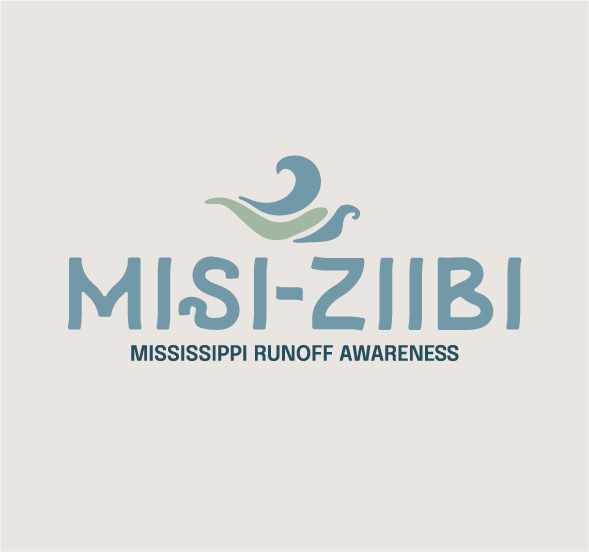
Misi-ziibi
Senior project exploring the brand identity of a non-for-profit nature conservationist company.
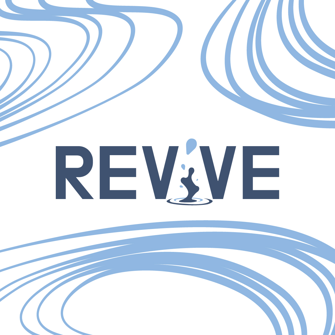
Revive Sports Drinks
A brand identity exploration for a sports drink company that is trying to disrupt the competition.
Modified Typeface
Project with a stipulation of changing a typeface.
ISSL Logo
Logo competition winner
5 Panel Sequence
A timeline illustration poster
Tournament Posters
Poster duo that catches your attention with the bright colors and unique illustrations.
CHPA Conference Logo
Company conference logo that needed a fresh idea.
CHPA Sponsorship Booklet
A booklet for CHPA to showcase the sponsorships of the Conference event.
Senior Capstone Misi-ziibi
Overview
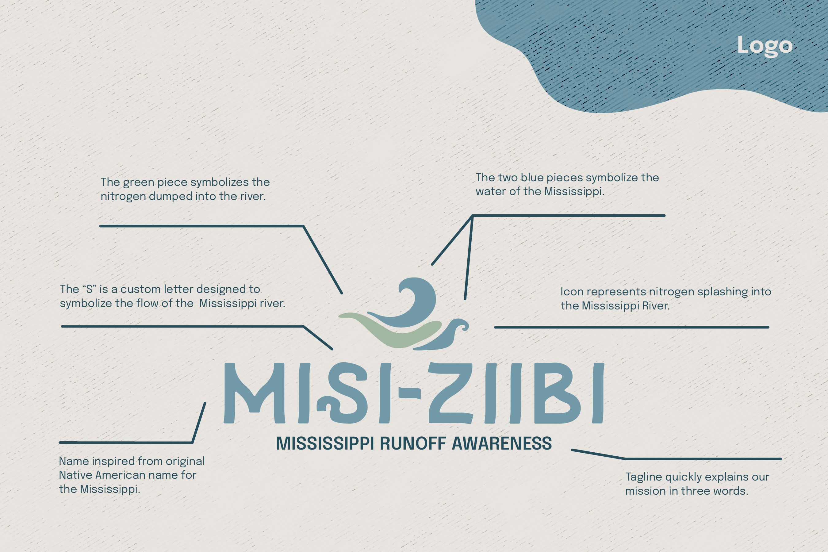
This project was my senior capstone. The goal was to pick a non-for-profit industry and create a company within that industry then craft its brand identity. I chose nature conservation due to my love for being outside and found myself getting ideas for the Mississippi River.
Research
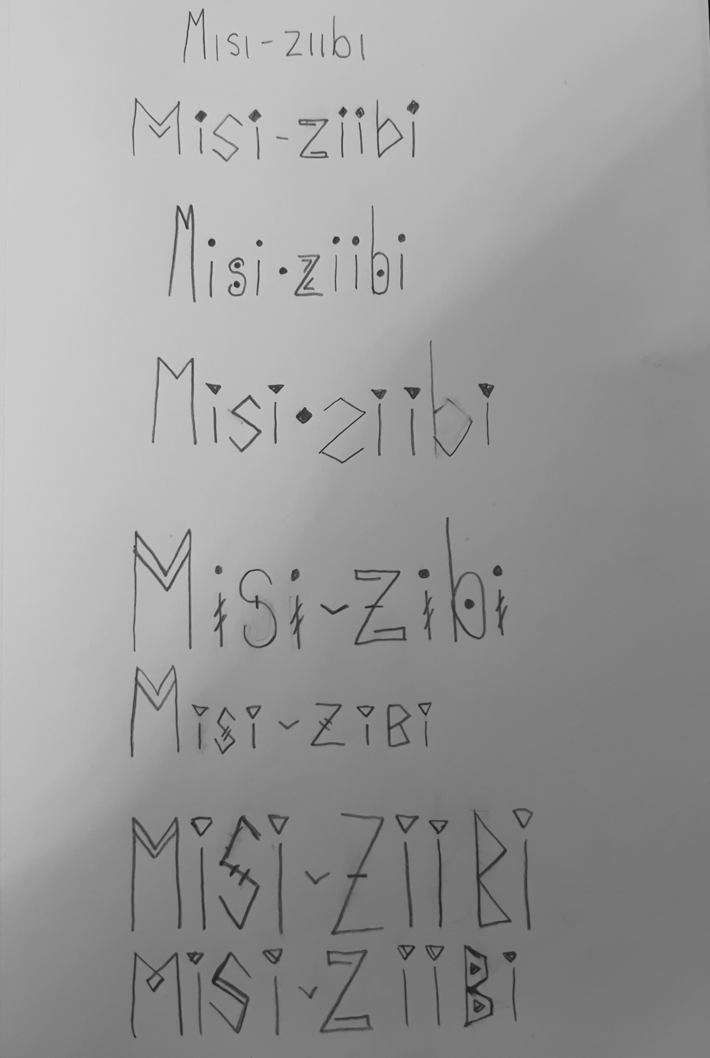
With deep research, I came across this Native American name for the River, misi-ziibi. After finding this unique sounding name, I started trying to craft a logo that encompassed the Native American feel to it.
Sketches
My first thought was to encompass those aesthetic of the Native Americans. Taking inspiration of their unique hashes and lettering styles. Only to come to the conclusion that it is way too busy looking for a logo. So I went a more simple approach.
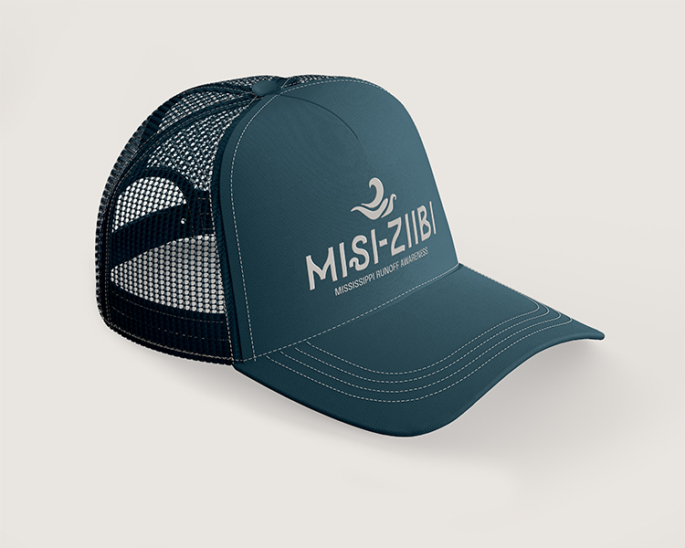
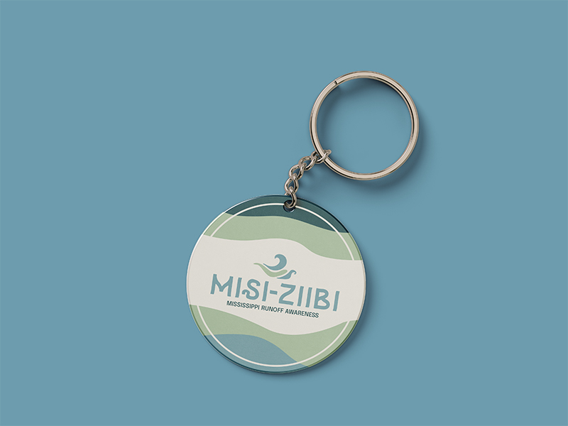
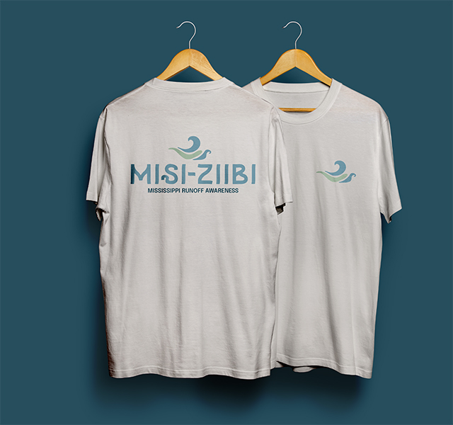
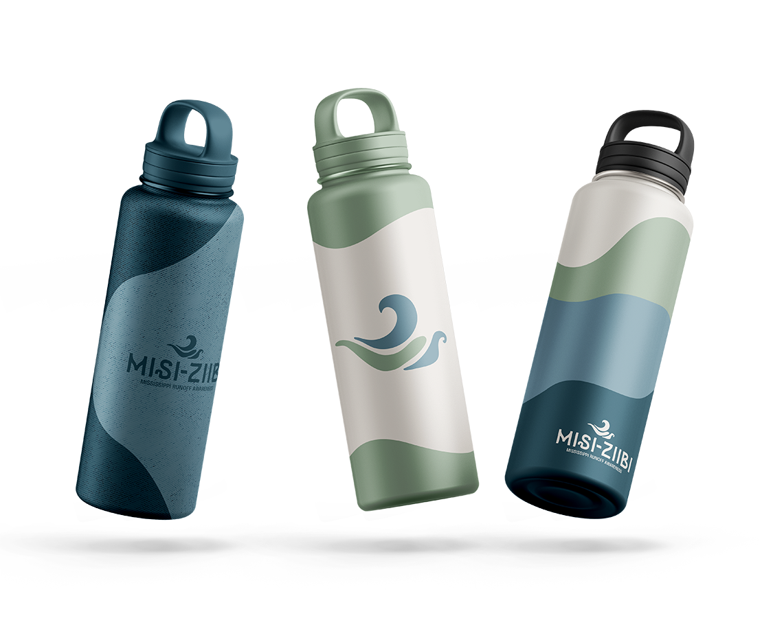
Merchandise
After I created most of the branding, I started to design the Merchandise I wanted to be able to "sell" on the company website.
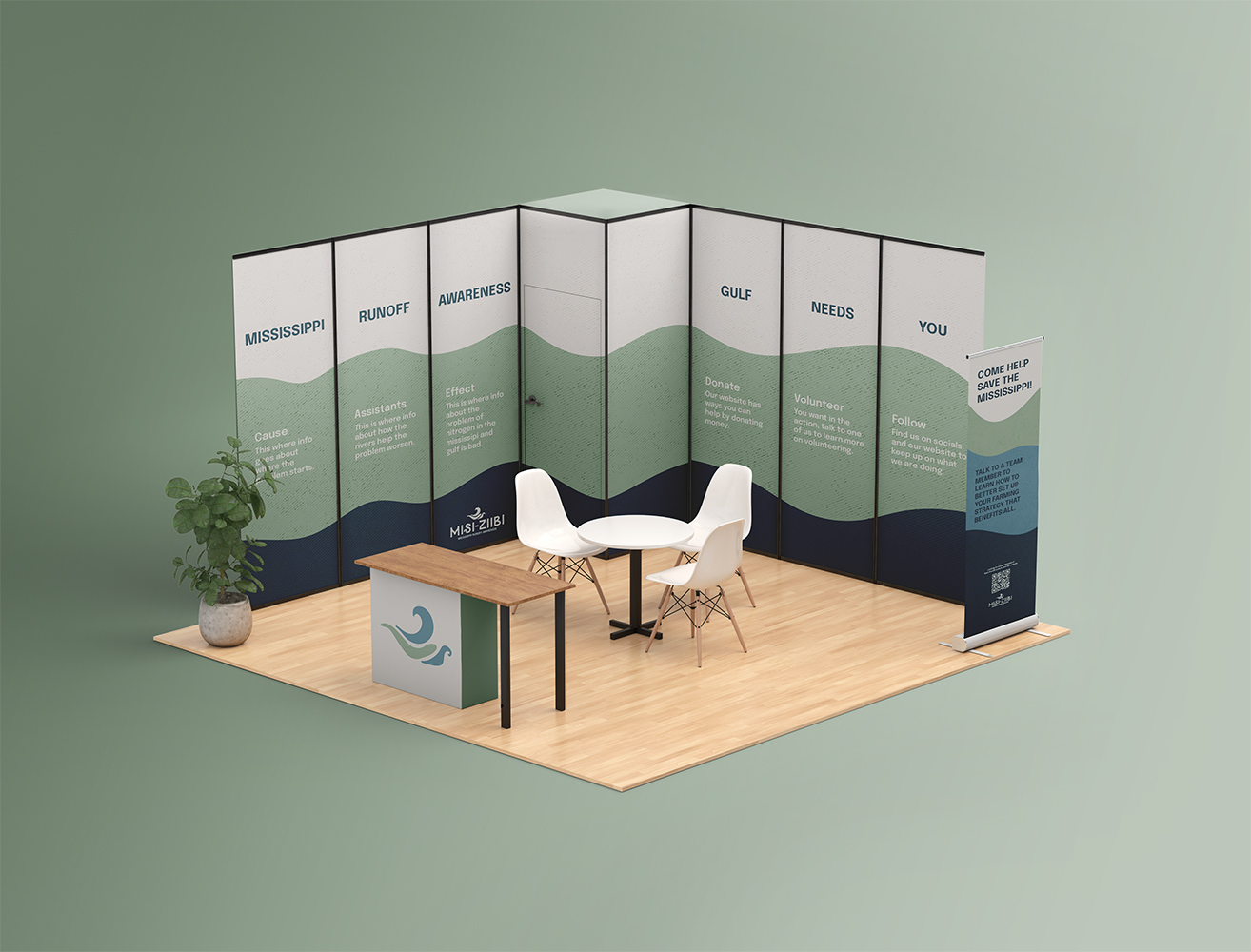
Convention Booth
The booth was very enjoyable to design, basically creating panels of information. I wanted to create an inviting place for people passing by to have their attention grabbed. Then want to learn more.
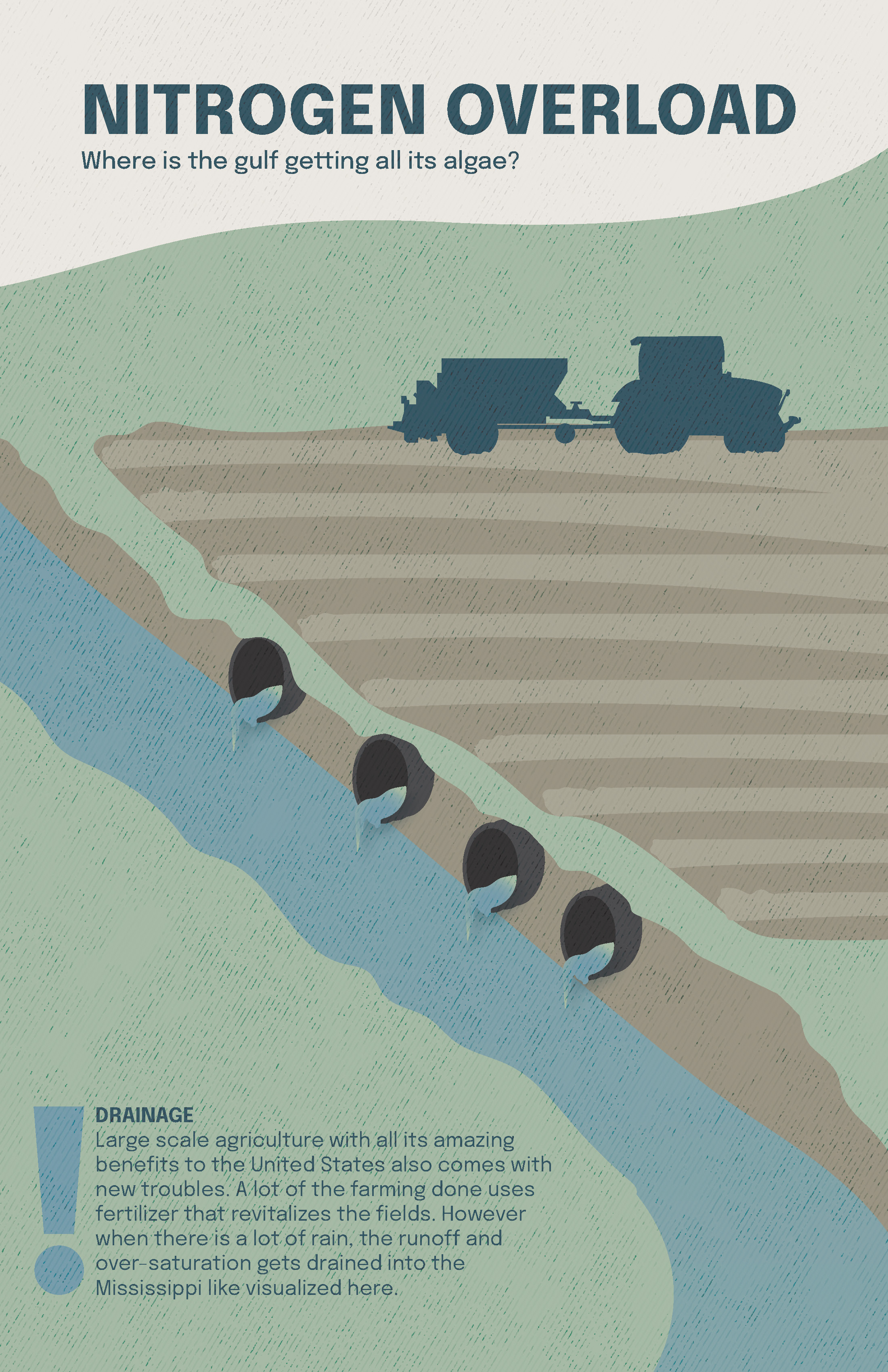
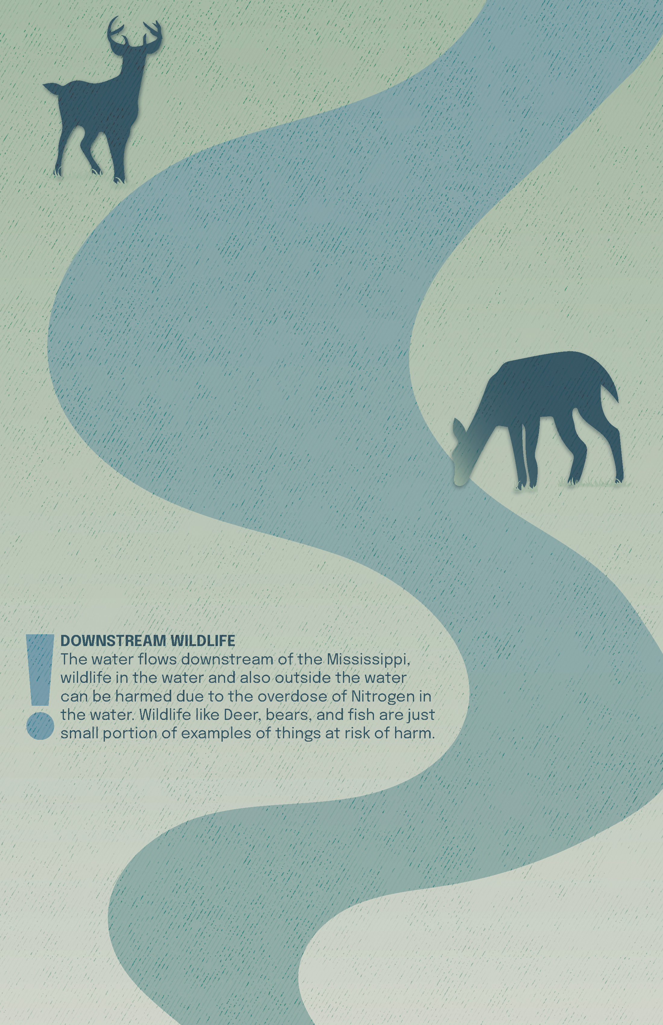
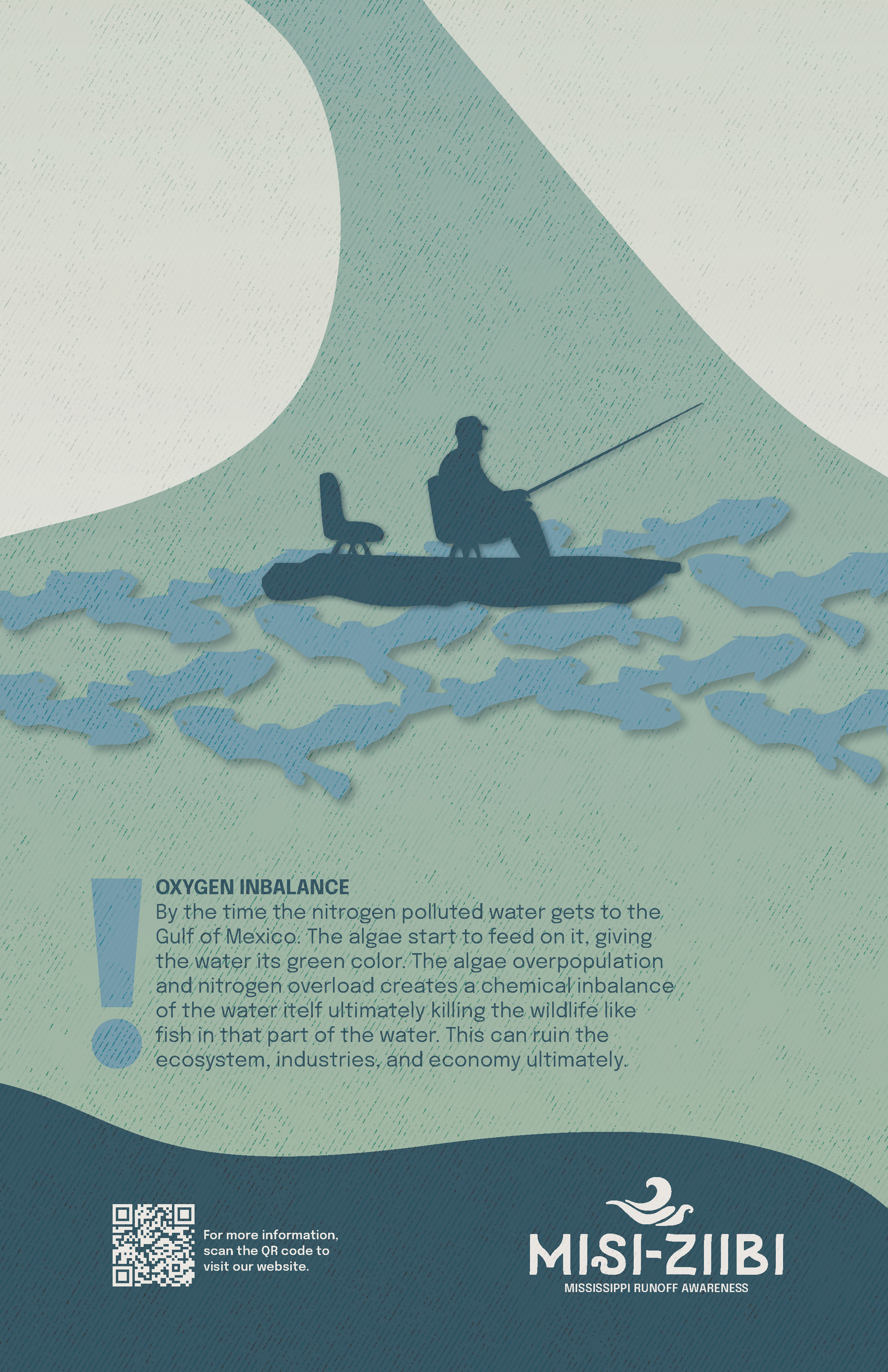
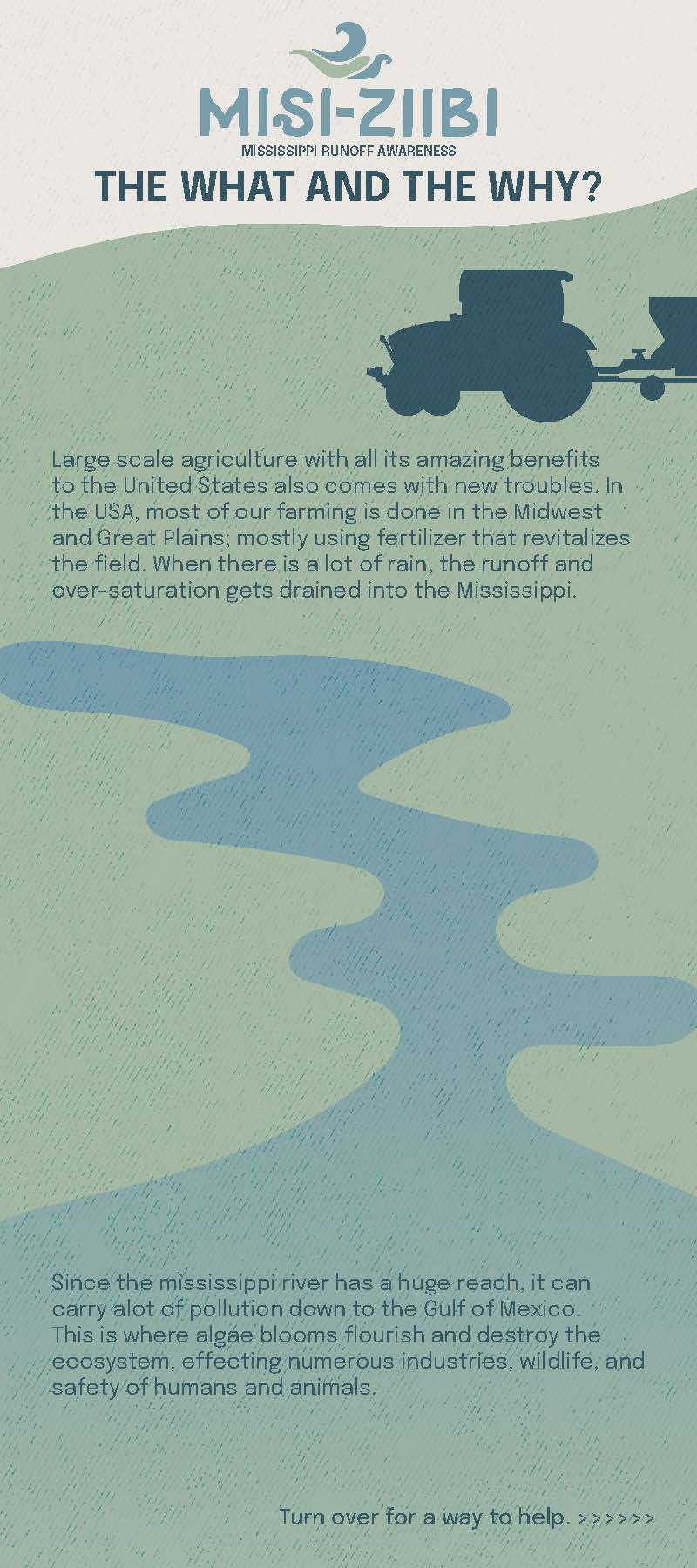
Poster Series
The poster series, meant to be viewed vertically, showcases the life of Nitrogen. From application on the fields, to going into the rivers and streams, getting dumped into the Mississippi River, the effects of wildlife, then ultimately reaching the gulf and its effects on industries that rely on the River's wildlife and purpose.
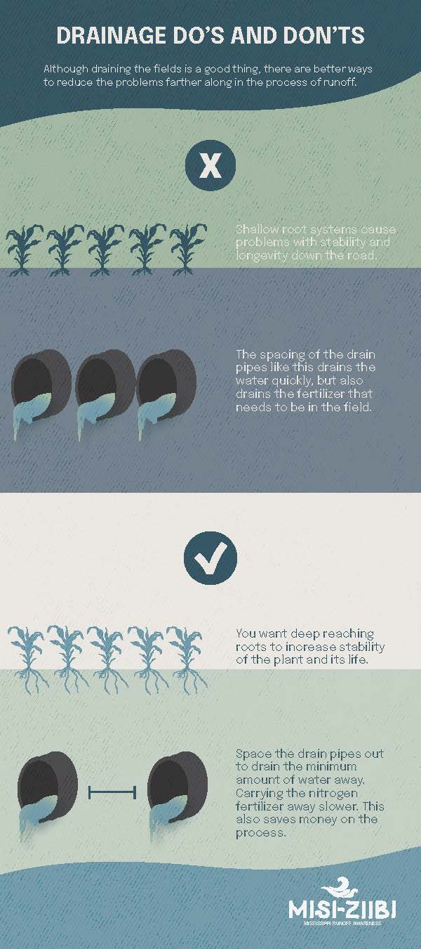
Pamphlet
This infographic is like a mini version of the posters, created to be able to pass out at the booth.
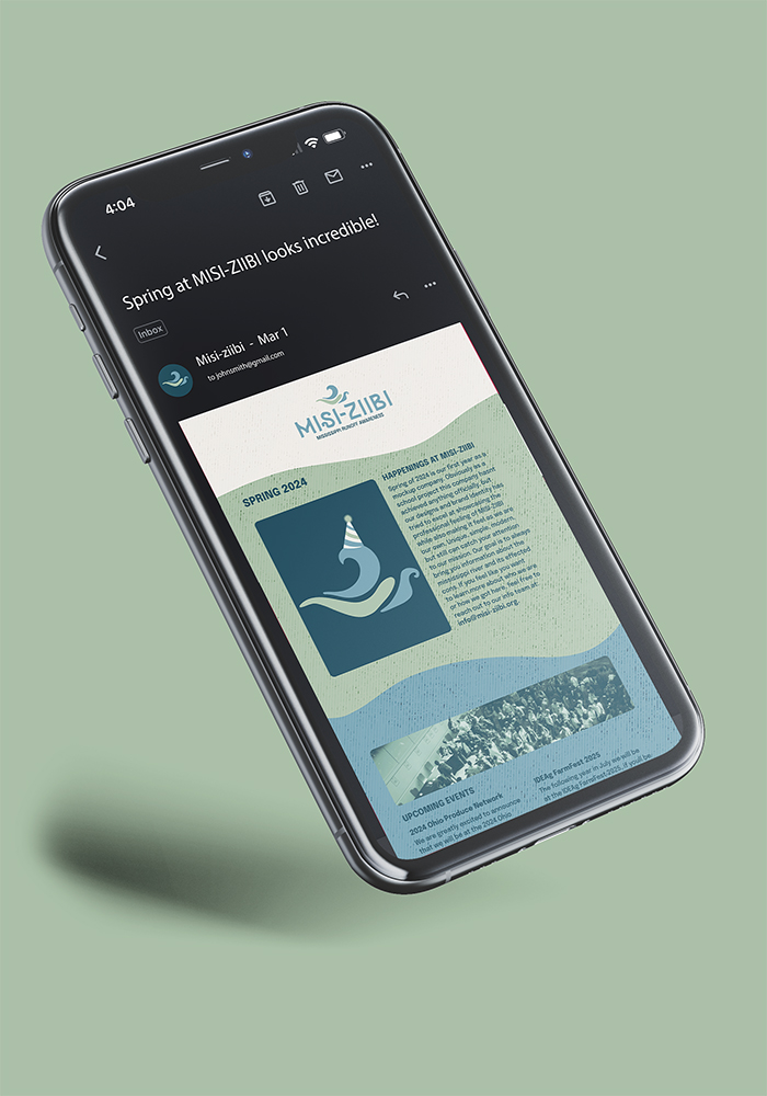
Email Campaign
I made a simple email list to act as a quarterly update of the company. First edition shows the birthday of the company and what is happening in the coming weeks. Plus some events that Misi-ziibi will be at.
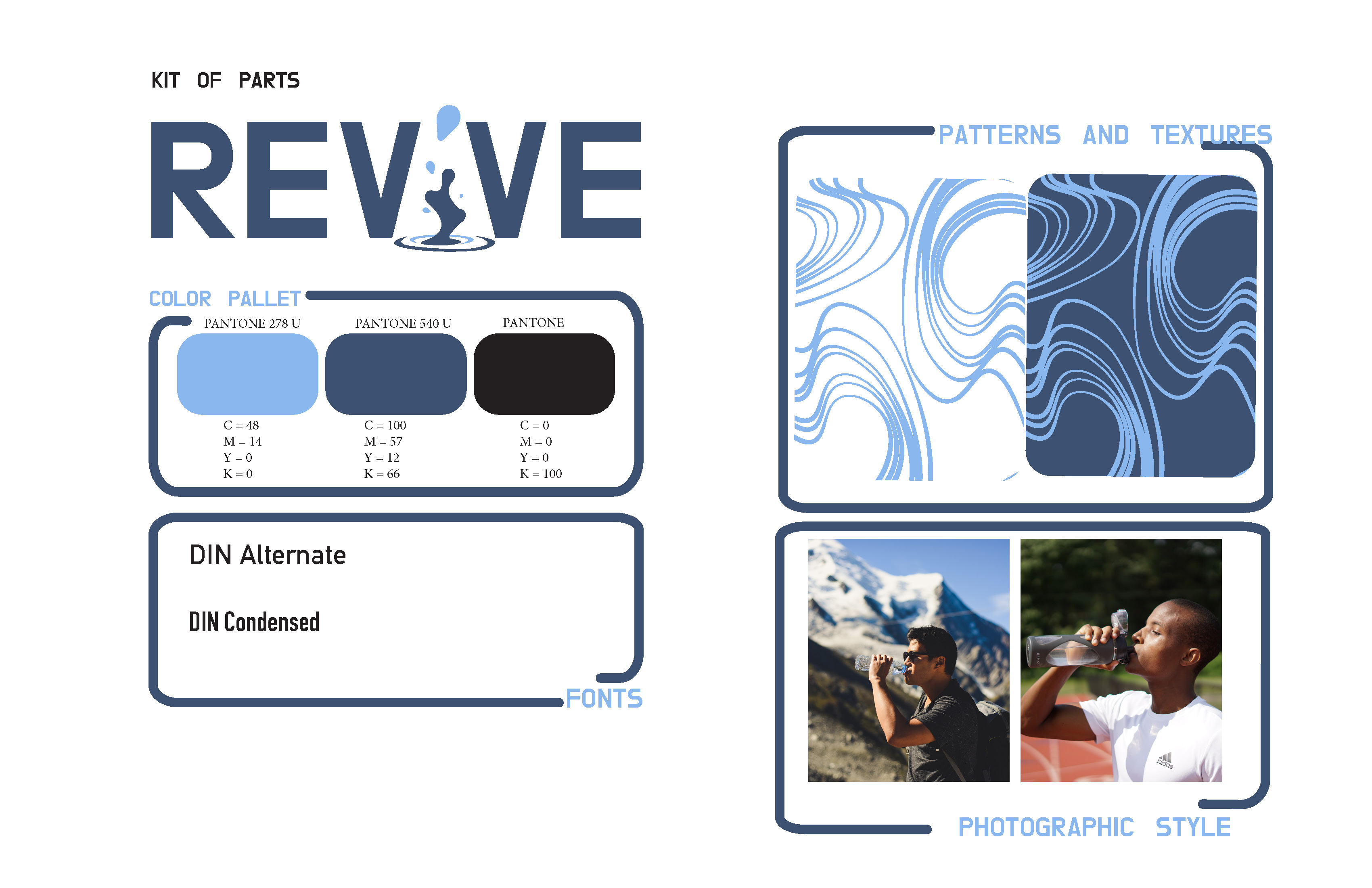
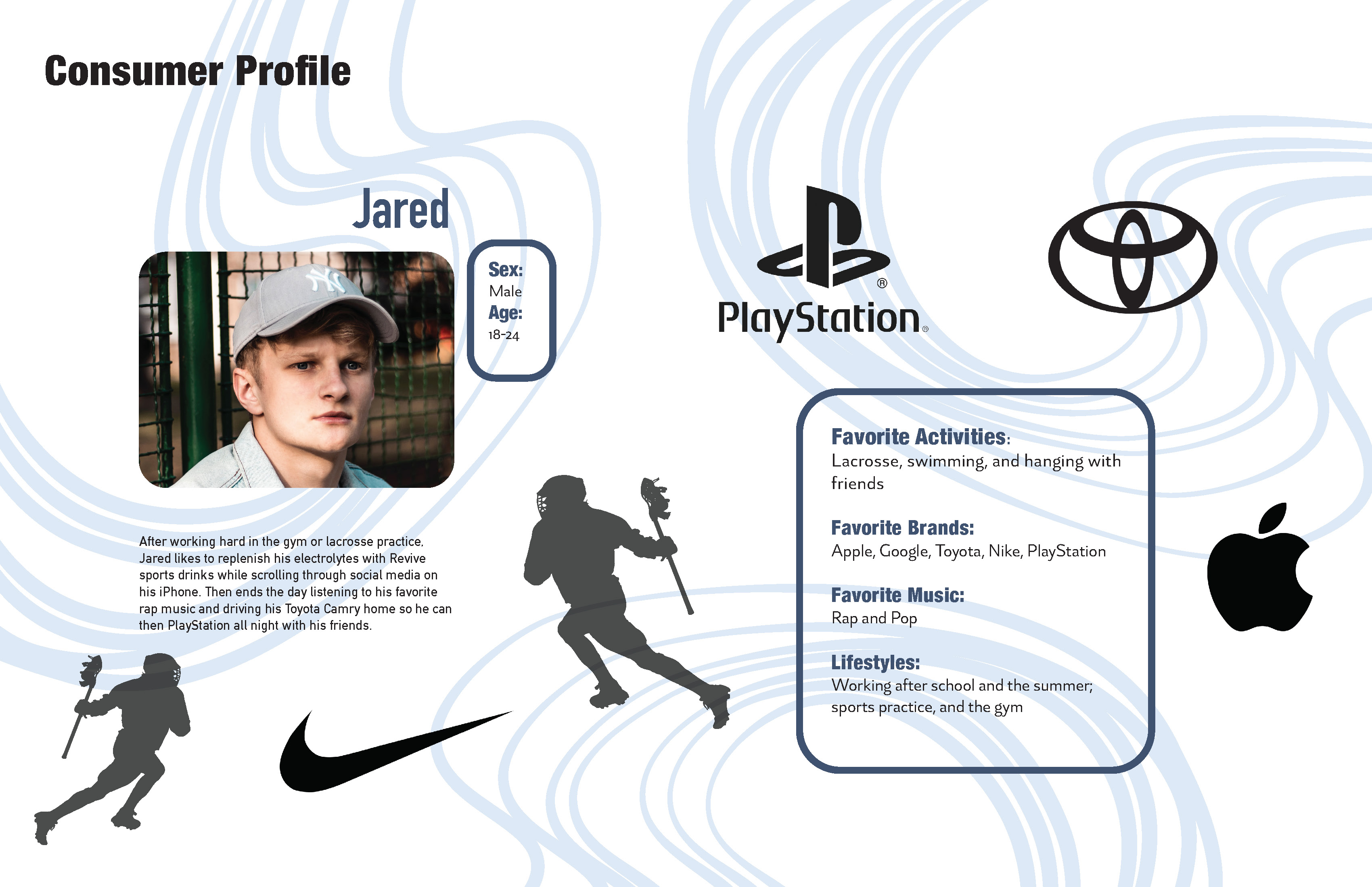
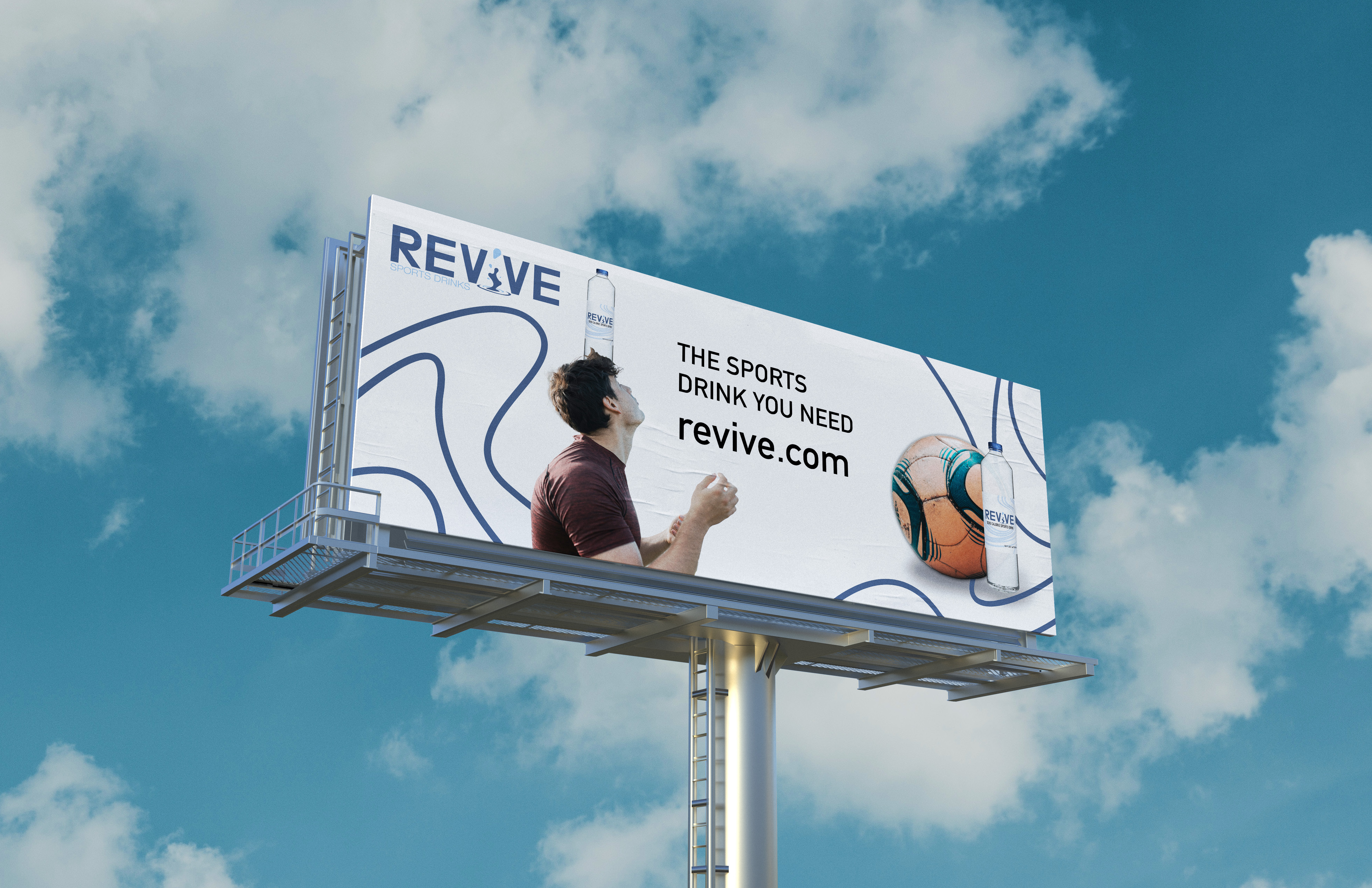
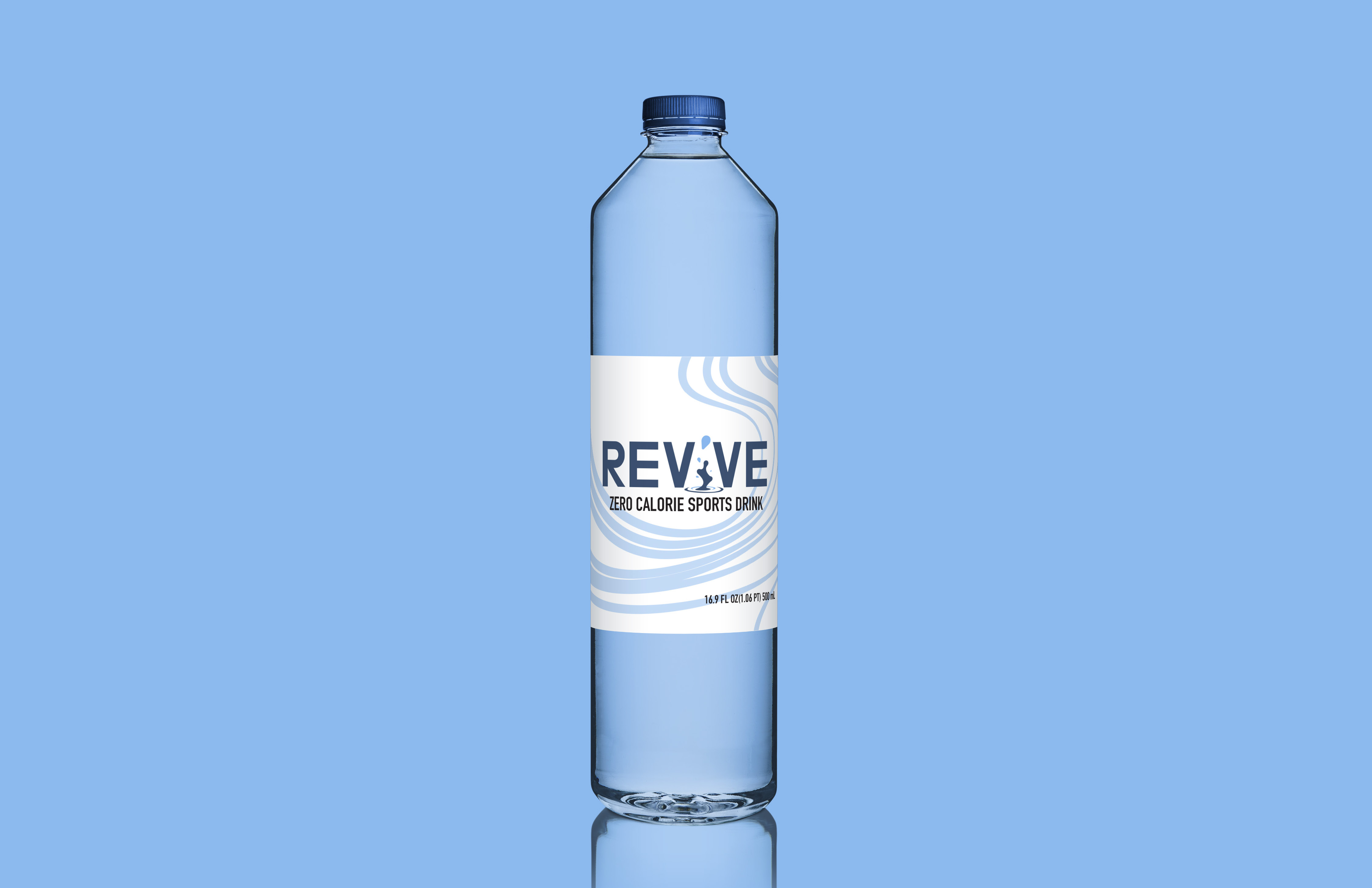
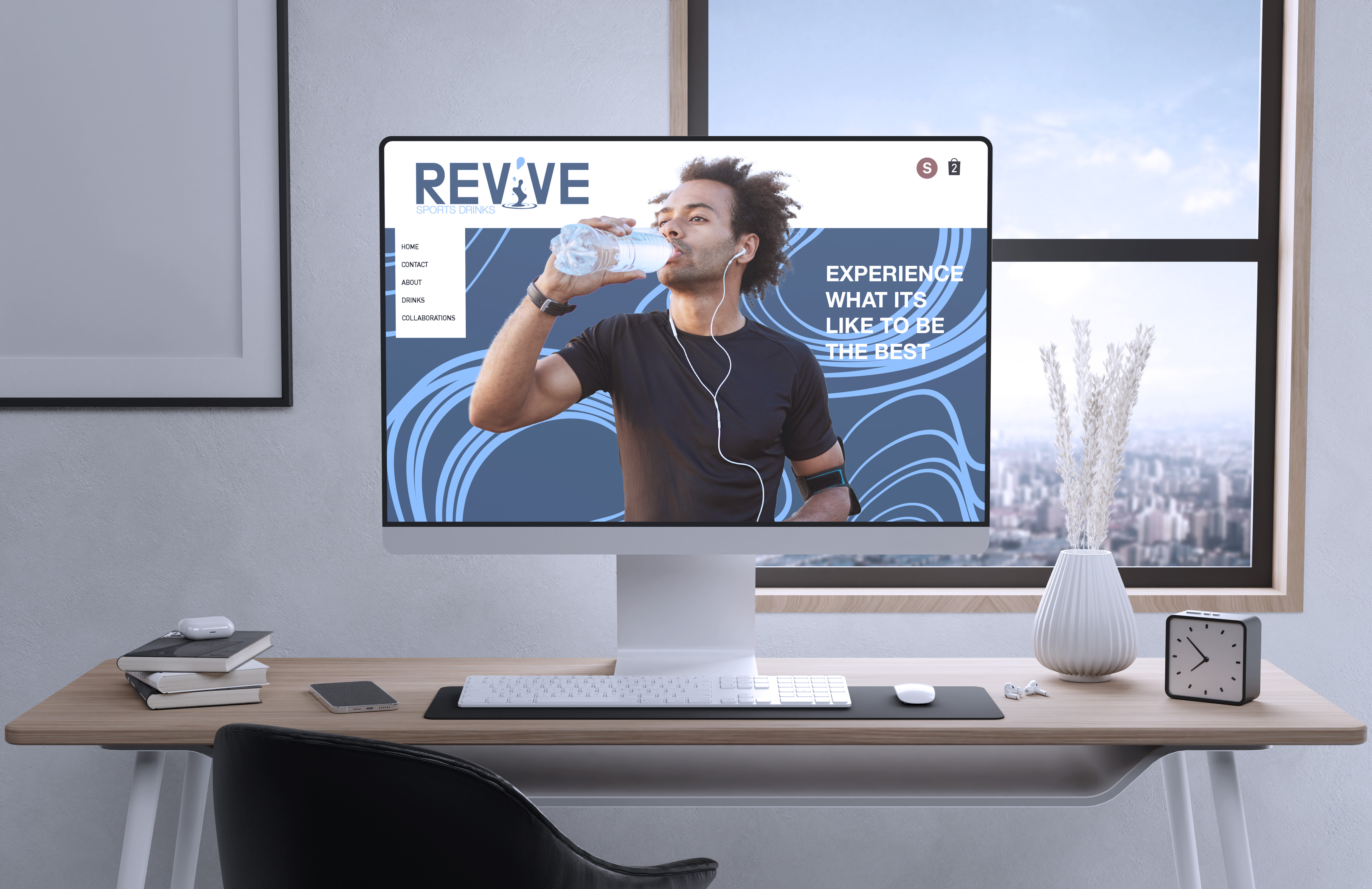
Revive Sports Drinks
Overview
The brand exploration for a company that focuses on the sports drink market. I learned a lot about how to research consumers and market our product towards that specific consumer group, while also standing out from the competition.
Approach
How I designed it to stand out was going with a color that people don’t often use in that market; navy blue. But to make us pop on the grocery store shelves was going to be the white background of the various packaging on the bottles. Something that also isn’t used in that specific market. It was really fun and enjoyable to complete such a large project.
Revive Logo
I wanted the logo to pop out at you. As well as have a creative twist on the word Revive. With the "I" being a water plop.
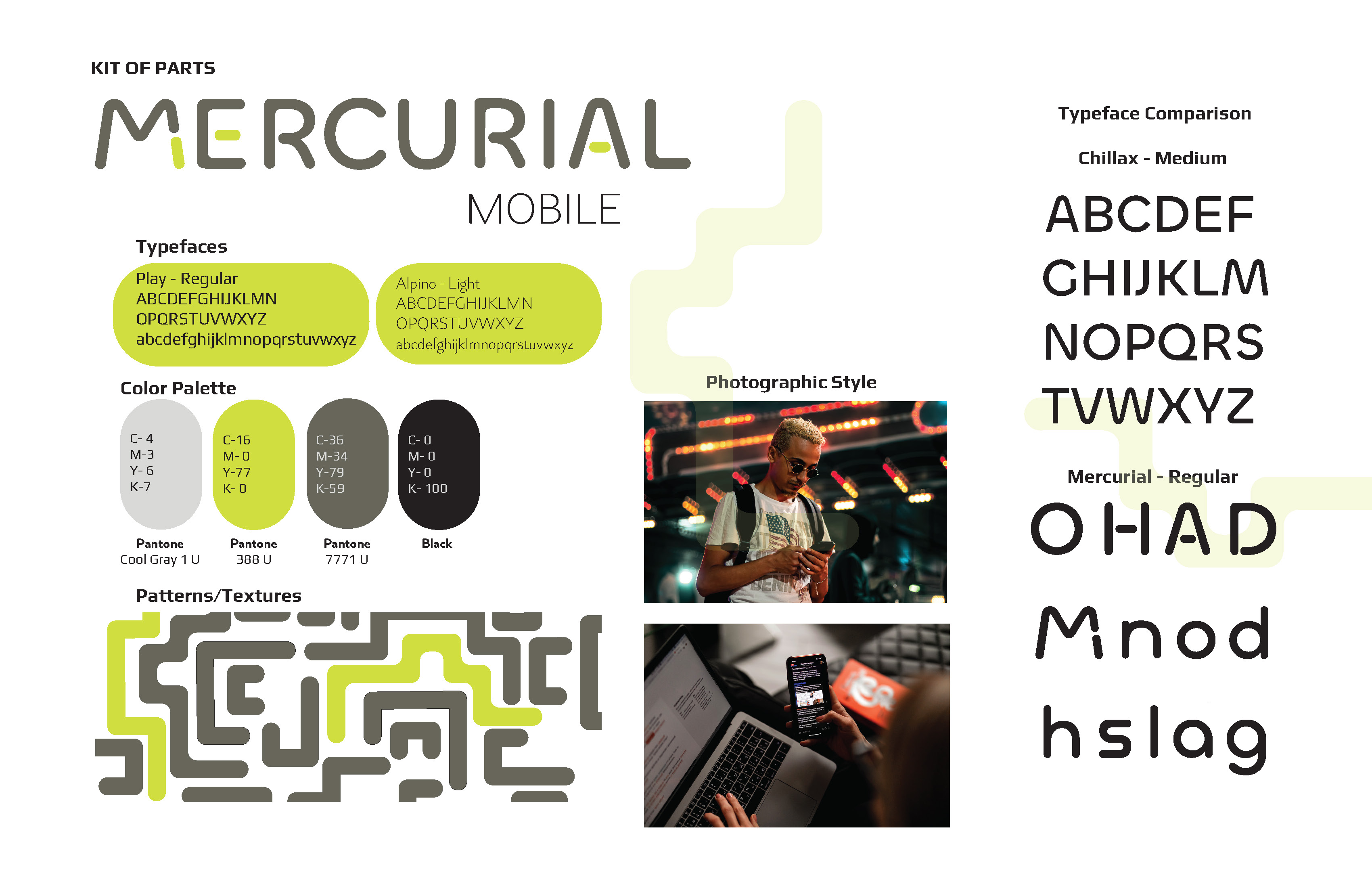
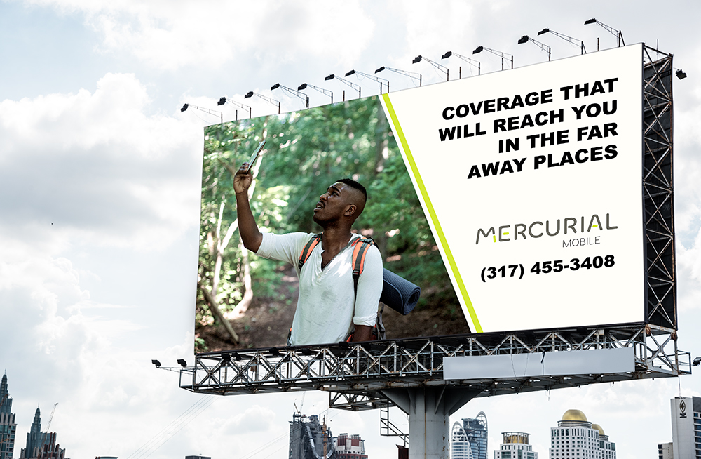
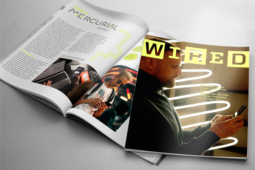
Modified Typeface
Overview
The goal of this project was to modify an existing typeface into a wordmark logo. First, the typography I chose and modified gave the brand its own identity, then I built the brand around the logo mark identity. To expand the brand I used different deliverables like; a featured story in a magazine, advertisement poster, advertisement billboard, and mockup of a cell phone box. .
Mercurial's Logo
I converted a typeface to encompass the wordmark with some personality from the different pill shaped elements.
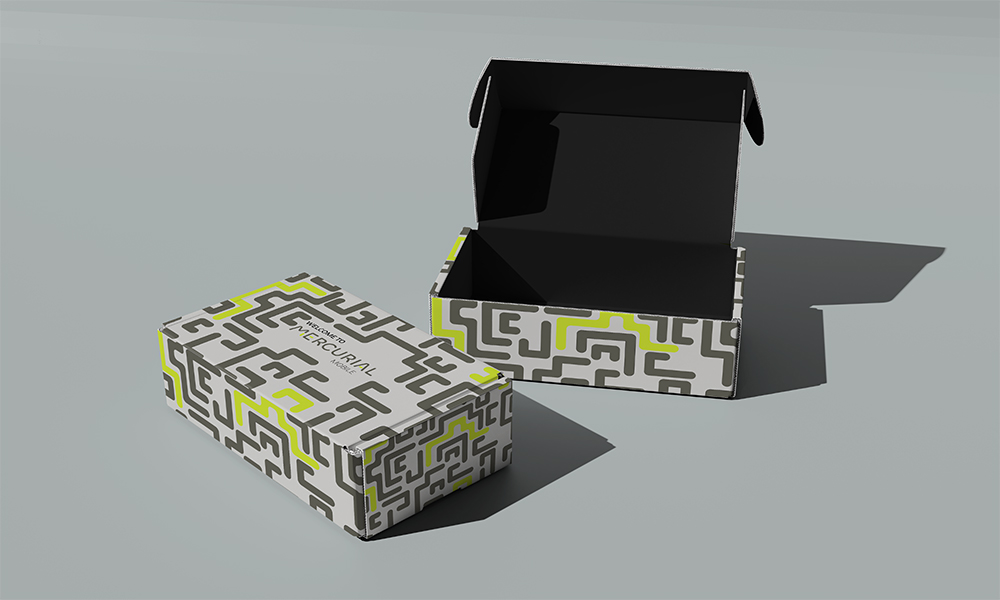
Other Assets
Other parts of the project is a box that your phone gets delivered in, a billboard for advertisements, and a featured magazine article.
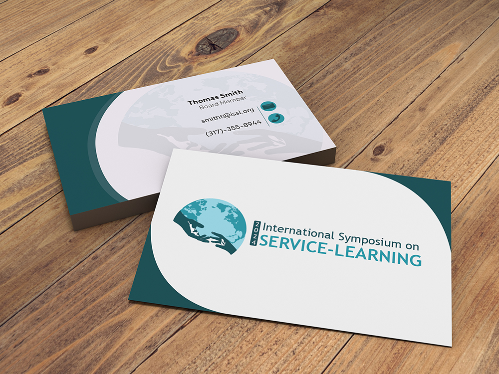
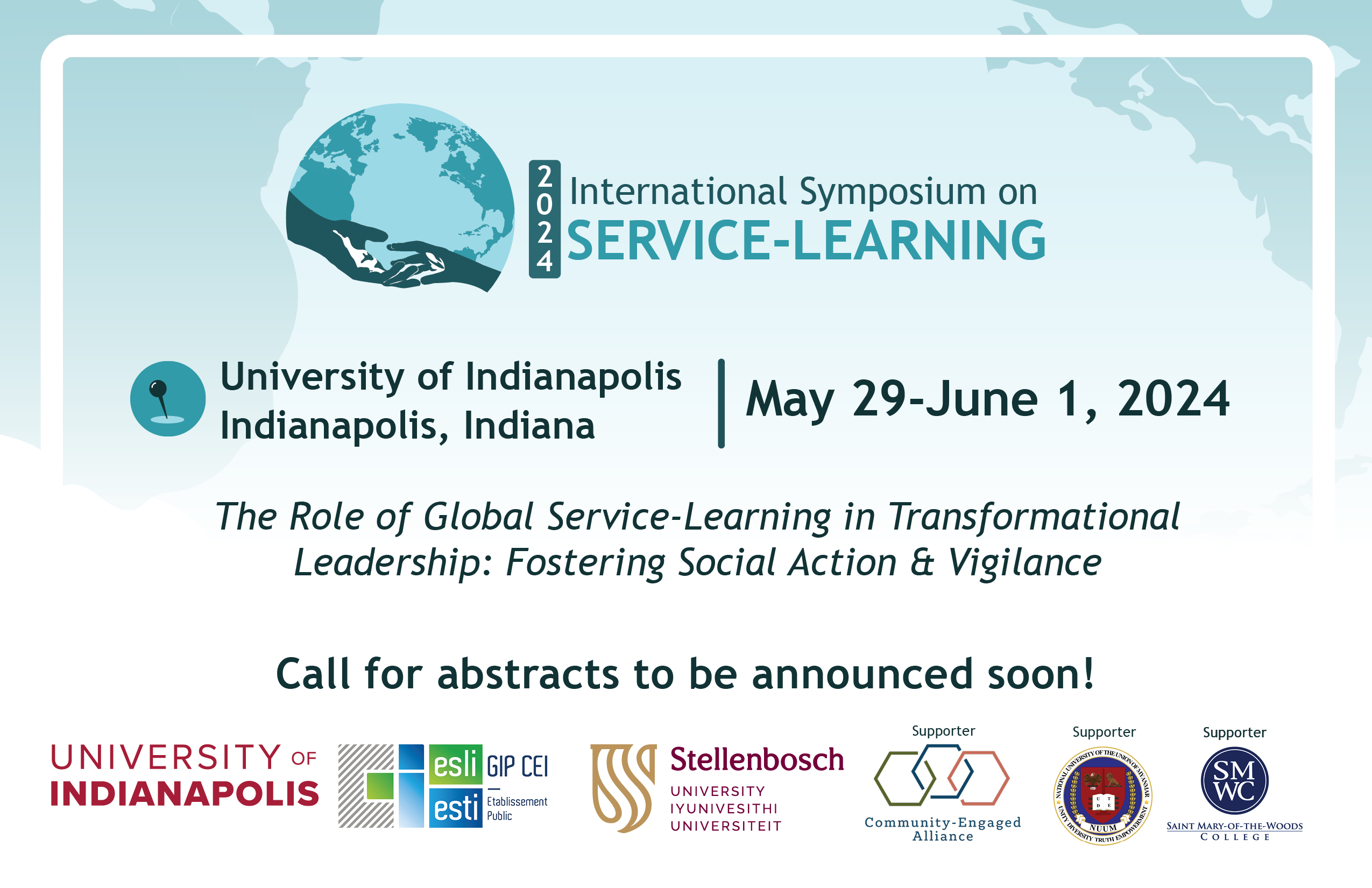
International Symposium for Service Learning
Overview
This project highlights the values and objectives at International Symposium on Service Learning by honing on the their strive for community and compassion for others. My design of the helping hands encompasses that value. Then tying it with their international status with the single color globe symbolizing that they want everyone to come together as one community who helps each other. The color I chose symbolizes that meaning of compassion.
Five Panel Sequence
Overview
This accordion style project was really exciting to create. The overall composition is a timeline about the evolution the soccer ball went through over the decades. The main goal of the design was to start thinking about how to convey motion through design and making it easy for our eyes to flow through the project while also effectively communicating the information as legible and organized.
Approach
My first idea was to make a timeline and have the ball go through appearing through each age and the ball changes as it goes. I think I conveyed that Idea till the end. Illustrating this entire timeline was one of the most enjoyable parts. Then seeing it come out really nicely in the end.
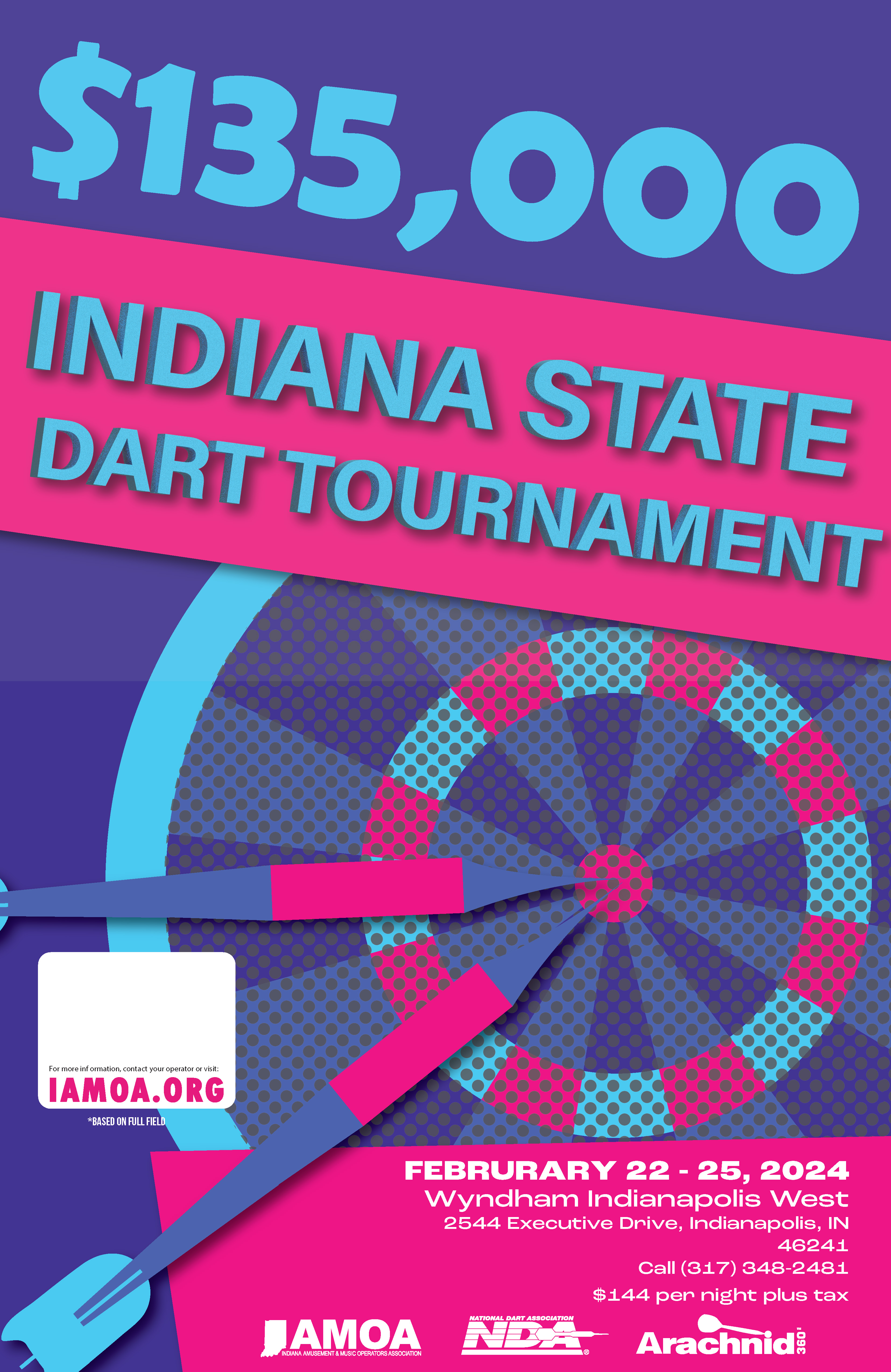
IAMOA Tournament Posters
Overview
Set within a bar or darker room, these posters were to be designed to stand out from the get go. And not just catch your eyes, but to "CATCH YOUR EYES" kind of way.
Approach
What I ended up doing was finding two color combinations that not only looked good and pleasing to look at, but also vibrant and caught your eyes. Then tried to take creative leeway and play with the perspective.
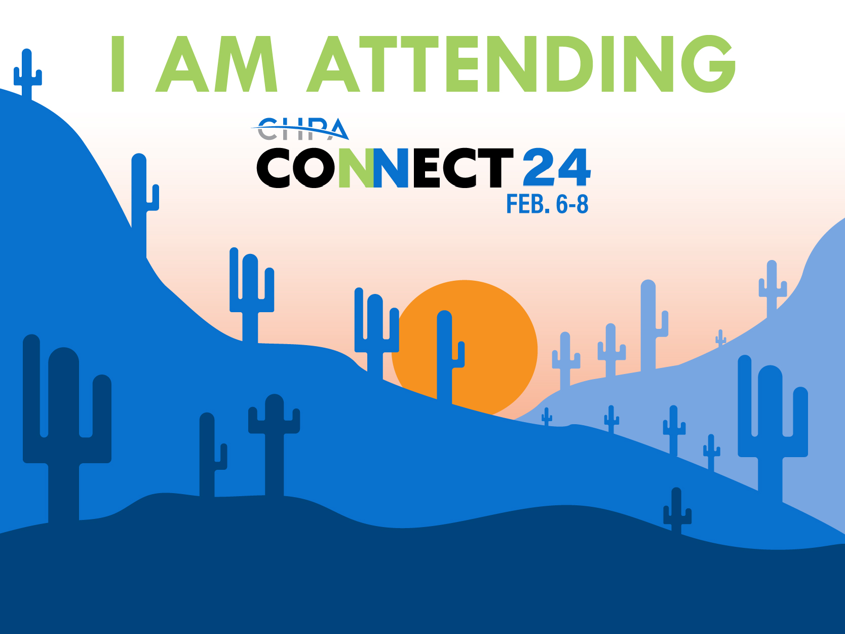
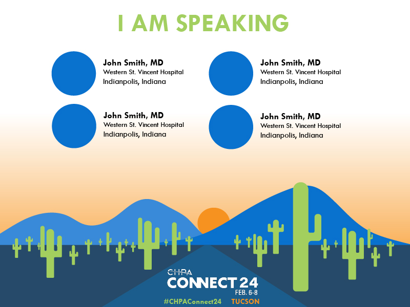
CHPA Connect 24 Branding
Overview
Through my internship at Raybourn Group International, I was tasked with many projects that grew me as a designer. This conference branding was one of them that took most of my time getting perfect.
Approach
As I played around with sketches and research, I had a lot of ideas in my head about where the branding could go. They gave me terms and ideas to go off of and I took those and brought them fresh looking ideas when they were stuck in the mud.
The Logo Itself
This was the final logo. The more I work on the logo and created ideas from what they asked, they kept coming back to simplicity. I was quite reminded and brought back to design 101 class, logos need to be simple and easy to identify. Its a simple 'connection" of the two letter n's in connect. They could not have been more happy with this direction and we finally had our winner.
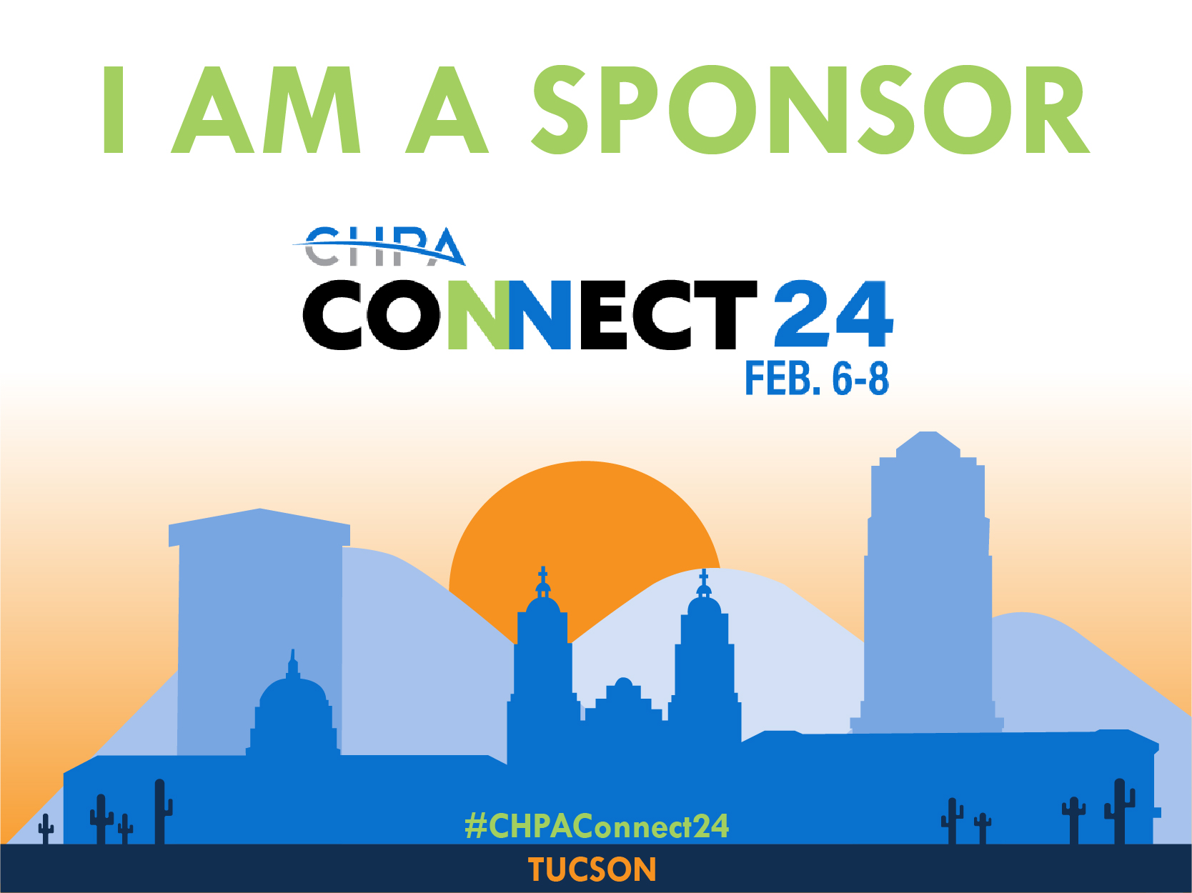
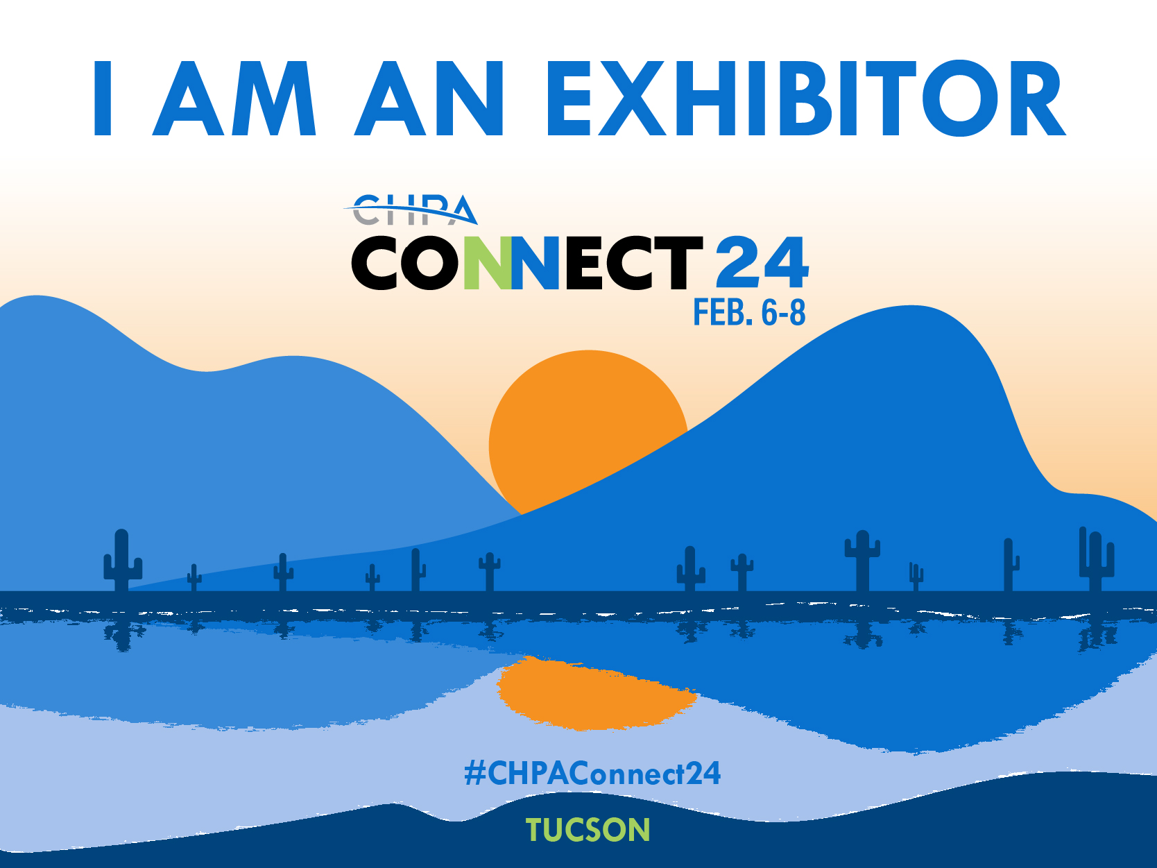
Marketing Graphics
These graphics are digitally crafted and illustrated by me to encapsulate the Arizona sun where the conference was going to be at. Each one different parts of the city and its suburbs.
CHPA Sponsorship Booklet
Overview
One of the largest projects at my internship. This sponsorship booklet I ended up doing about 95% of the design work crafting it and applying the branding of the Conference that I also designed.
Approach
A straight digital design. The booklet was going to be seen by people looking to sponsor, so it needed to be easy to read and make information easily ready to comprehend visually.
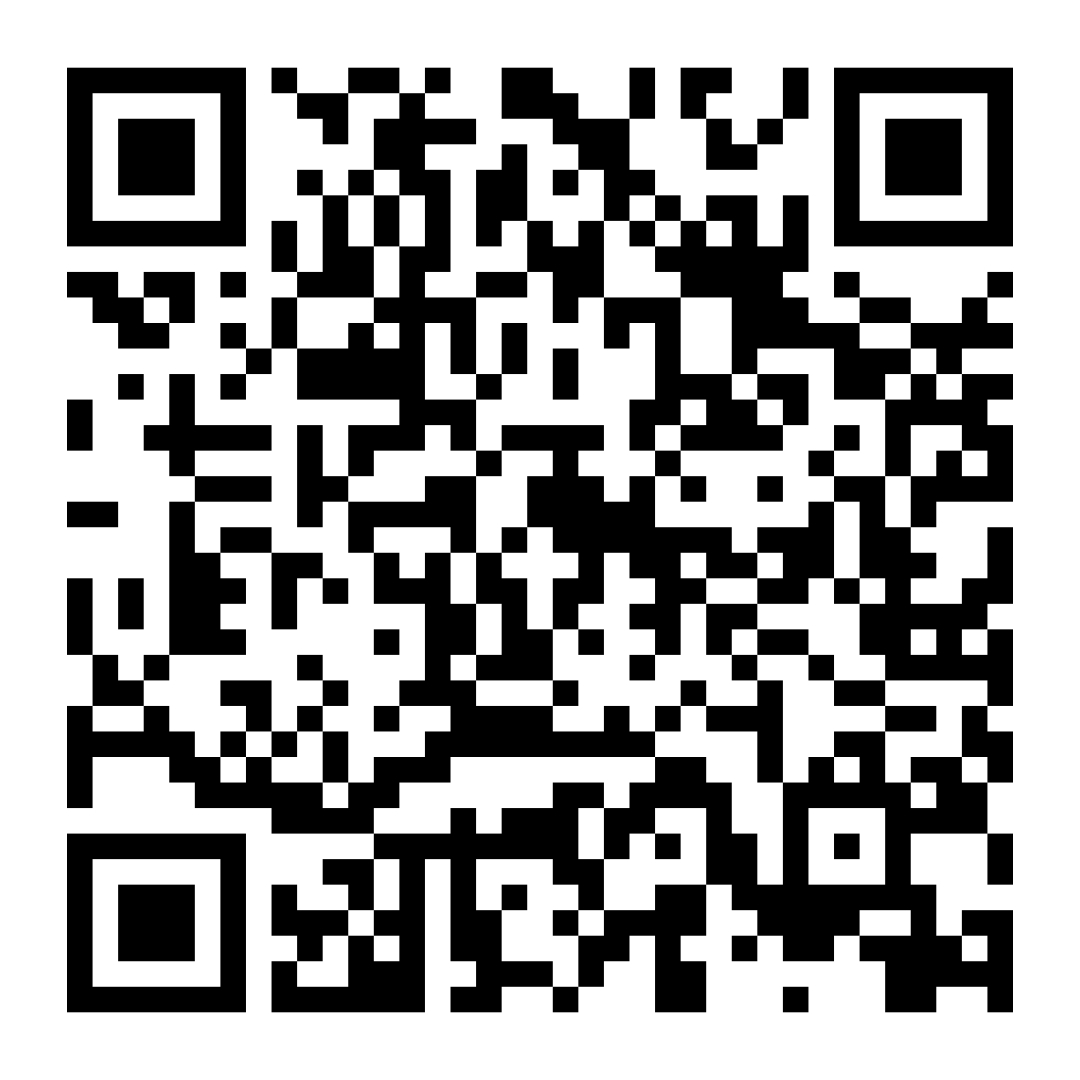
QR Code to the Digital Booklet
The booklet was never going to be physical, only digital. So this code takes you to the website to view the booklet and experience the digital booklet animations.